
Christopher A Spencer Sr.
Graphic Design & Multimedia
Portfolio

The concept of the design is to draw your attention to the different array of color in type. Also the arrangement of type from smallest to it largest proportion! The sort of blending style configured to look as calligraphy with the unity of offset pattern of type made into a brush.

This is where the moon beam of light comes in handy to light the traveler way to success. I also used the rectangular marquee tool around the top half of the light & set a motion blur on it to fade it into the clouds. This effect was applied several times to achieve the look you see here now. Next font was a Meroitic Hieroglyphic of ‘Is a Dime One’ symbolizing the ancient Egyptian writing that was used to communicate in that era. It also aided in the search of a Kings tomb which treasure lai

Adjusting the highlight & brightness in a car without affecting the actual pixels. Also adding a marque around a certain selection of to not affect such attributes but make certain correction to rest of the image.

Repairing area of the image with the clone stamp tool. Adjusting saturation wit the sponge tool to enhance the concept of the design. Also replacing colors in an image using the color replacement tool by zooming in on the desired subject, choose fine edge & lower tolerance. Selecting the hat & make the necessary correction.

I selected a dark blue background placing the images on a separate board to edit them on to my canvas. First I took each butterfly out of it original background using the quick selection tool. I placed a refine edge on each then give them a mask so I can edit them if necessary. I then turned them all into brushes, setting one green, one black & the last one in different colors. Then I use the quick selection tool on two of the butterflies, black & green one. I minimize the quick selection brush
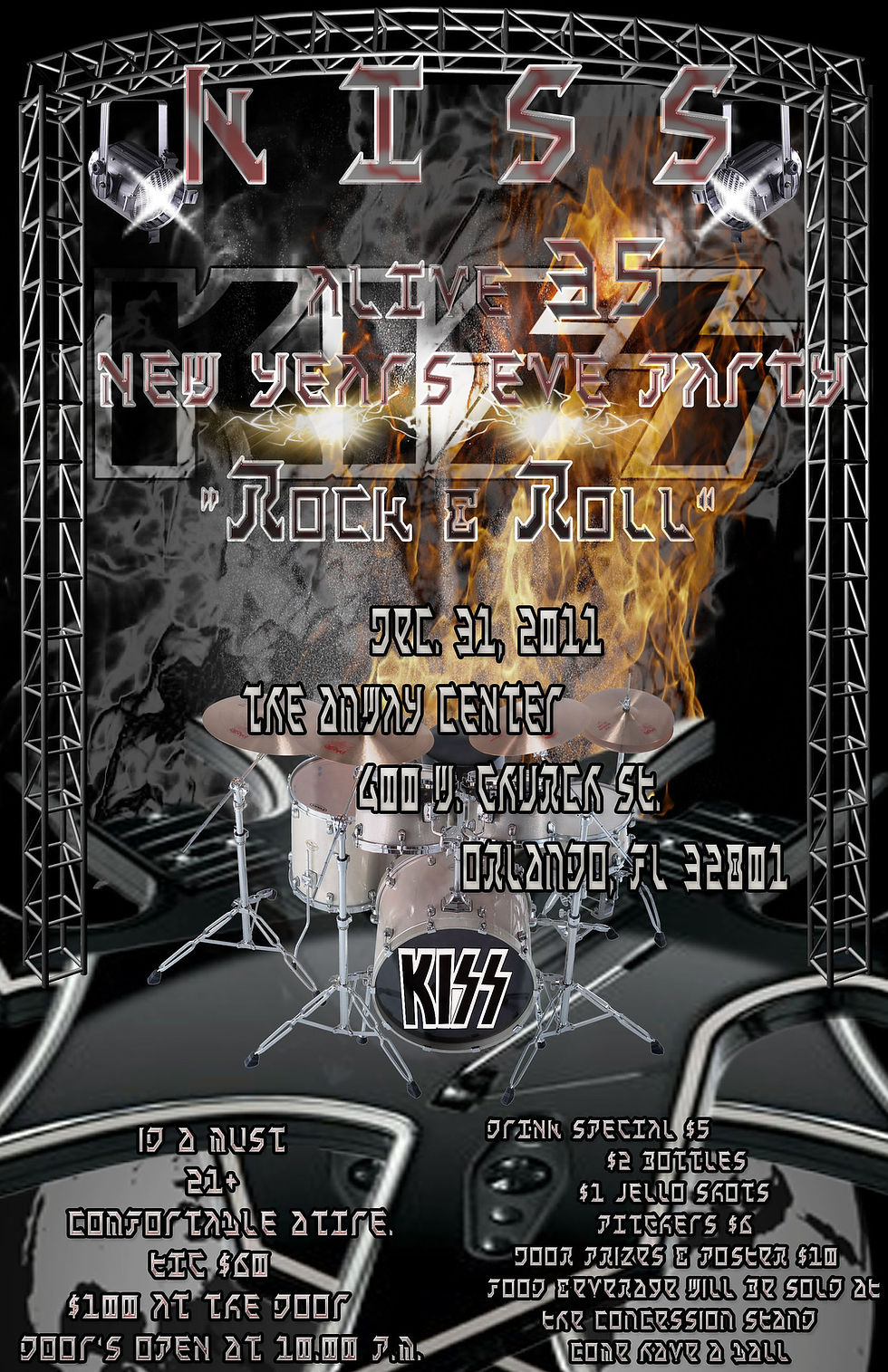
I’m promoting a ‘Kiss’ live concert event in my concept poster design. I will be using energetic fonts that illustrate the Kiss logo. They’ll be in a fiery red text that I’ve learned off a tutorial I’ve done on http://www.youtube.com/watch?v=0x59L5fnuQA&feature=related. Then I will place a gradient effect over it to give it a more natural look. I will incorporate black, white, red, orange & blue color palette. I’ve included a blue lighting brush around the guitars that’ll cross one another in th

Creating a document with multiple artboards. Using tools to create basic shapes. Join & outline Objects. Edit strokes with the Width tool. Work with Shape Builder tool. Working with Pathfinder commands to create shapes. Use Live Trace to Create Shapes. Scale & Duplicate Shapes.

Using live trace to create a shape by turning a raster image from Photoshop like a drawing & convert it into a vector path or a live paint object. Thus using the comic art present in live trace & expanding the tracing object allowing the paths to become editable. in Adobe Illustrator.

Draw Curves Line. Draw Straight Lines. Use Template Layers End path Segments & Split Lines. Select & Adjust Curve Segments Create Dashes Lines & Add Arrowheads. Draw & Edit With The Pencil Tool.

Working with the Layer panel. Create, rearrange, & lock layers, nested layers & groups. Move objects between layer. Paste layers of objects from one file into another. Merge layers into a single layer Apply a drop shadow to a layer. Make a layer clipping mask. Apply an appearance attribute to objects & layers. Isolate content in a layer.
Graphic designers use knowledge of fine art, marketing and computer software to visually communicate an idea or message. Learning the skills needed to become a successful graphic designer through a variety of projects.
a final student portfolio to demonstrate your skills to potential employers
instruction in effective page layout, web design, image editing, print production and digital design skills
courses that help prepare you for industry-standard Adobe certificates*
such as InDesign®, Illustrator®, Dreamweaver® and Photoshop®